Source: Freepik
In a digital world, every website, business and brand is competing to grab attention and convert each visitor into a lead. CTA’s are a potent weapon that helps businesses meets their conversion goals by guiding website visitors through their buying journey. CTAs are meant to push prospects further into your sales funnel using strategic taglines, button, design or copy.
A CTA or call to action is a part of an advertisement, website page, content that motivates the visitor or reader to do something. CTAs can ask visitors to sign up, subscribe, avail free trial, and learn more about a product/service join a class or more. CTAs vary according to a business’ goal from content and digital marketing efforts.
An ideal CTA should have the potential to guide a visitor effortlessly so that they are allured to do something that a website or business wants them to do. Crafting the perfect call-to-action for your website is a critical part of web design and development process. Here are some great CTA examples by that can serve as a great inspiration to create the perfect CTA for your own website, landing page or any other marketing channel:
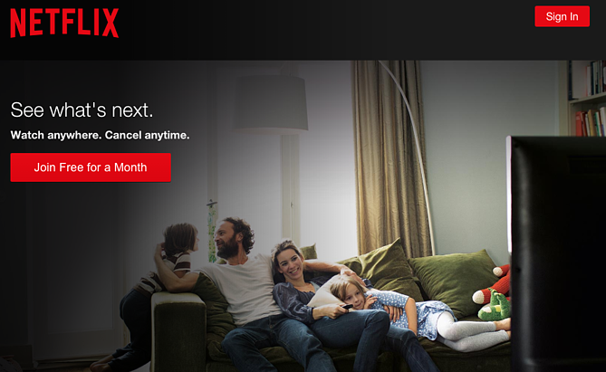
Netflix is the world’s largest video streaming provider and knows how to get its CTA right. Its CTA button ‘Join Free for a Month’ instantly captures the attention of the visitor. Further, the copy addresses the biggest fear of visitors wanting to sign up for something- the lengthy cancellation process. Its ‘Cancel Anytime’ copy along with free joining CTA makes the ultimate case for doing CTA’s right.
Not only it answers the user’s query that there are no risks related to subscription, it also entices a user to try out the service for free for up to 30 days.
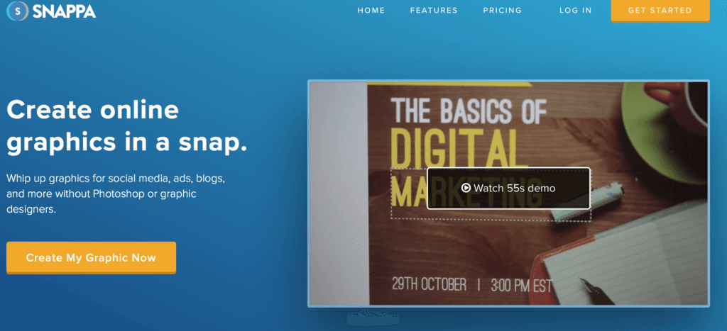
Snappa offers dynamic graphic design software and its home page is the perfect blend of visually appealing design and an impactful copy to make an impressive CTA.
The CTA button with the message ‘Create my Graphic Now’ stands out distinctly as it makes use of contrasting colors with respect to the background. The concise copy gives the right message to the users about what they can do with the software, making a strong case of a persuasive call to action.
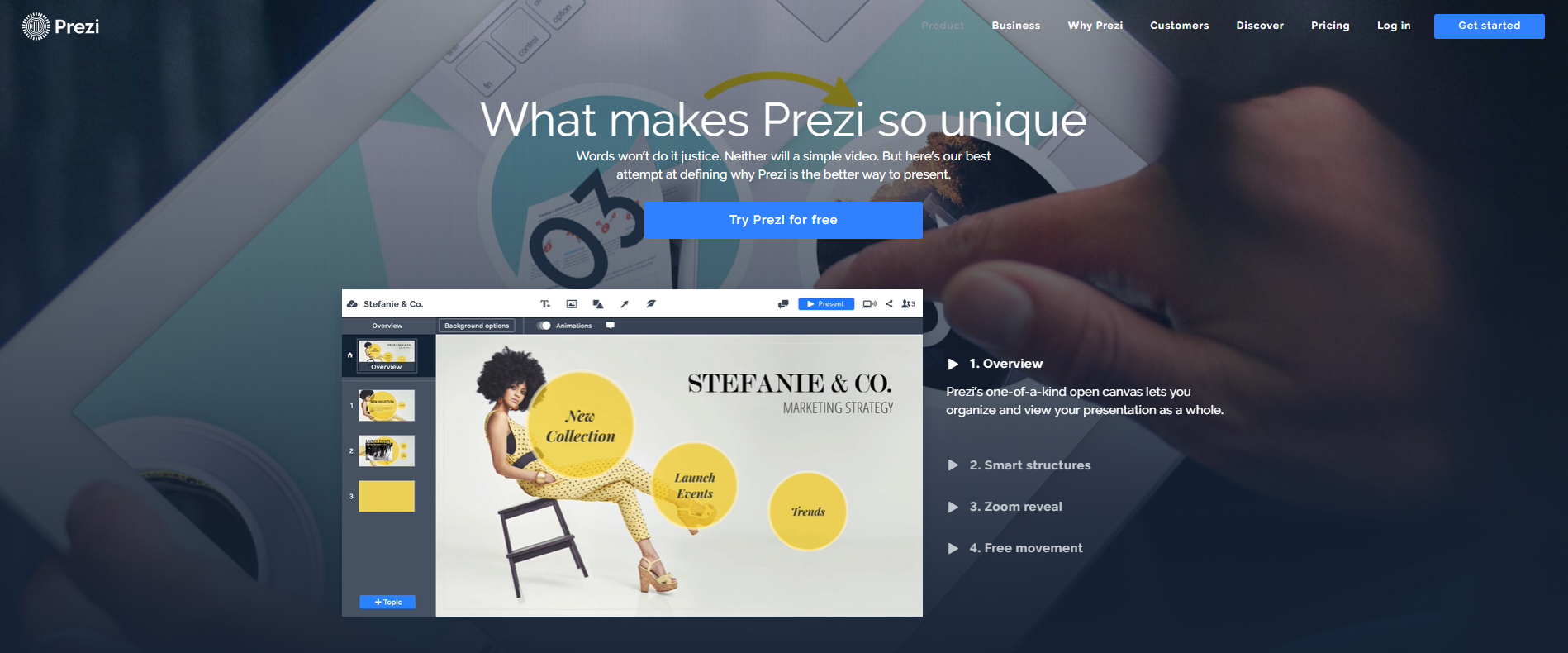
Prezi has been really diligent in promoting its product offering on its website. Its product page is a perfect testimony of how things should be. If you observe its CTA carefully, you will understand how it is trying to push people towards using its offerings.
Everything from the heading to its CTA button text appeals to the desire of a visitor to be more effective and better at presenting things. ‘Try Prezi for Free’ gives users a chance to take a sneak peek into what’s so special about Prezi.
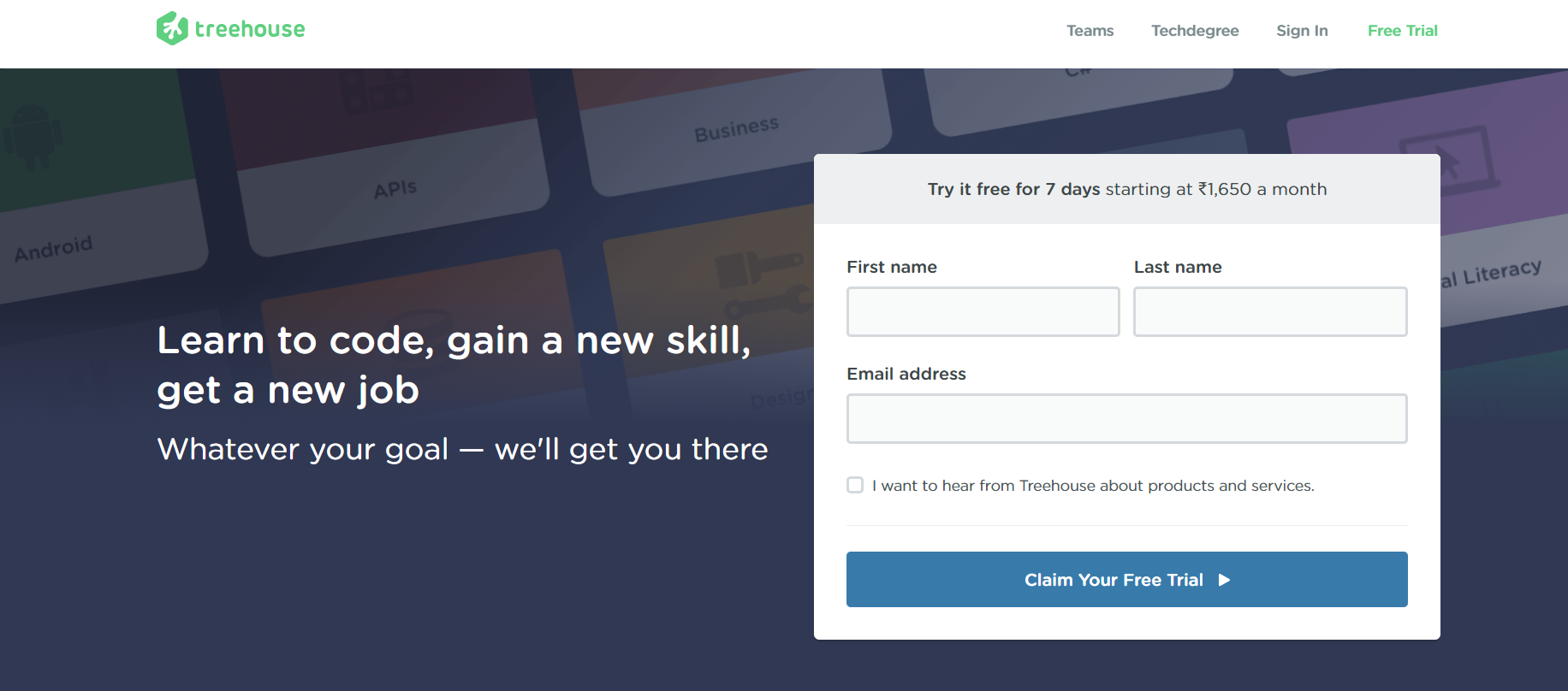
Treehouse is an online learning program for professionals looking to build a remarkable career. On its homepage, it has the perfect CTA in the introductory banner. Its banner copy ‘Learn to code, gain a new skill, get a new job’ drives the message home without overcomplicating things.
The compact lead form with a CTA button ‘Claim your Free Trial’ is much better than plainly writing start a free trial as it brings the visitor to the front seat through personalization and creating an urgency that you should claim this now or lose this opportunity. We wouldn’t be surprised to see the conversion rates shooting off charts.
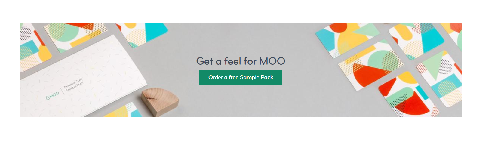
MOO has kind of an undisputed authority over business card designing domain. They claim to create outstanding business cards with superior quality finish. Their website is a reflection of their confidence and when we have a look at their CTA, we know they are quite serious about their quality superiority.
The CTA button says ‘Order a Free Sample Pack’ to actually keep visitors from moving away to competitors. As it is a premium brand, giving customers first-hand experience by providing free sample works wonders in the long run. And they know how to leverage their quality promise by creating the perfect CTA.
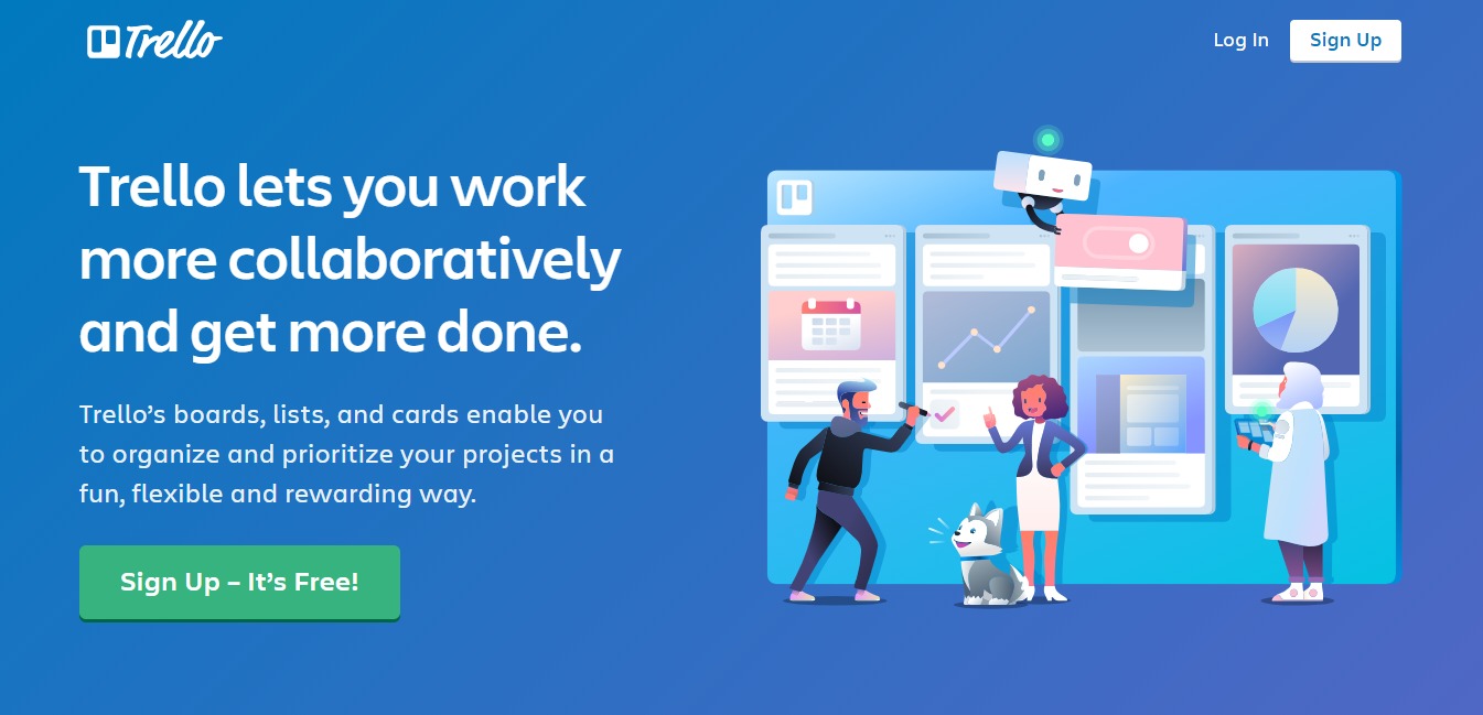
Trello has suitably leveraged research findings about CTAs that reveal that bold-colored CTA buttons improve click-through rates. Placing a green CTA button with white popups on a blue background gives it an edge.
Appealing to the typical consumer mentality, its CTA button conveniently states that signing up is free and makes people more interested in its offerings. On top of it, it’s simple yet powerful headline with self-explanatory sub-heading give visitors all the reasons to act positively.
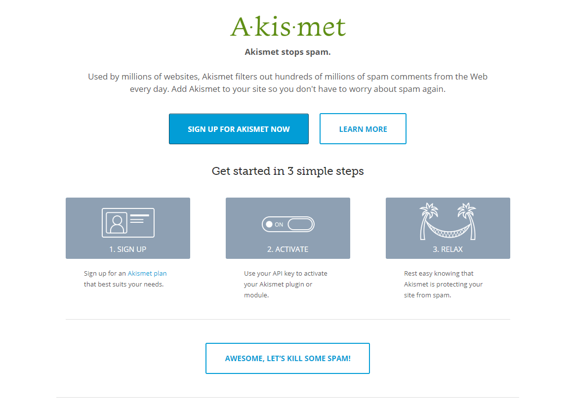
Akismet is a pioneer when it comes to handling spam on WordPress blogs and websites. It has made sure to point out its leadership through a great CTA on its homepage. Its homepage has three CTA buttons which shows a unique multi-CTA approach when it comes to driving conversions.
In fact, it’s trying to grab the attention of different kinds of visitors. What’s interesting is the way it has used a minimalistic design and a strong copy. The ‘Awesome, Let’s Kill Some Spam’ button below the process prompts users to instantly click the button.
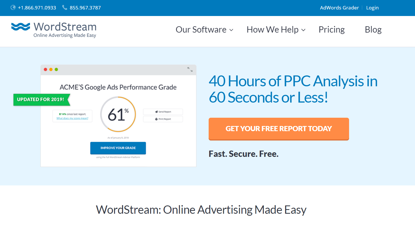
WordStream makes use of contrasting colors for its CTA button along with a copy that provides realistic figures on how it is useful in PPC analysis. Also, using the ‘Free’ word twice, once in the CTA button and other in subheading below definitely is useful in persuading visitors to try the service.
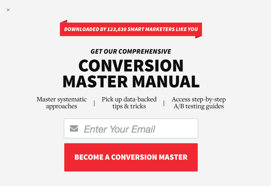
ConversionXL’s CTA uses a bold red color for CTA button along with a promising copy that makes visitors believe there is something in for them. ‘Become a Conversion Master’ is an enticing copy that makes user believes that they will receive a lot of value if they choose to sign up. The three-pointers in the subheading depict what all they will get on successful sign up.
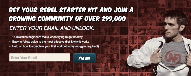
Nerd Fitness’ main agenda is to make users sign up for its fitness newsletter. Using a dedicated banner on its website, it tries to influence users to sign up to get a host of benefits and valuable resources. The copy tells the visitors that they will get an exclusive starter kit which is being used by more than 299,000 fitness enthusiasts. The community promise along with a unique CTA button copy that states ‘I’m in!’ works as a psychological trigger which can excite a visitor to sign up instantly.
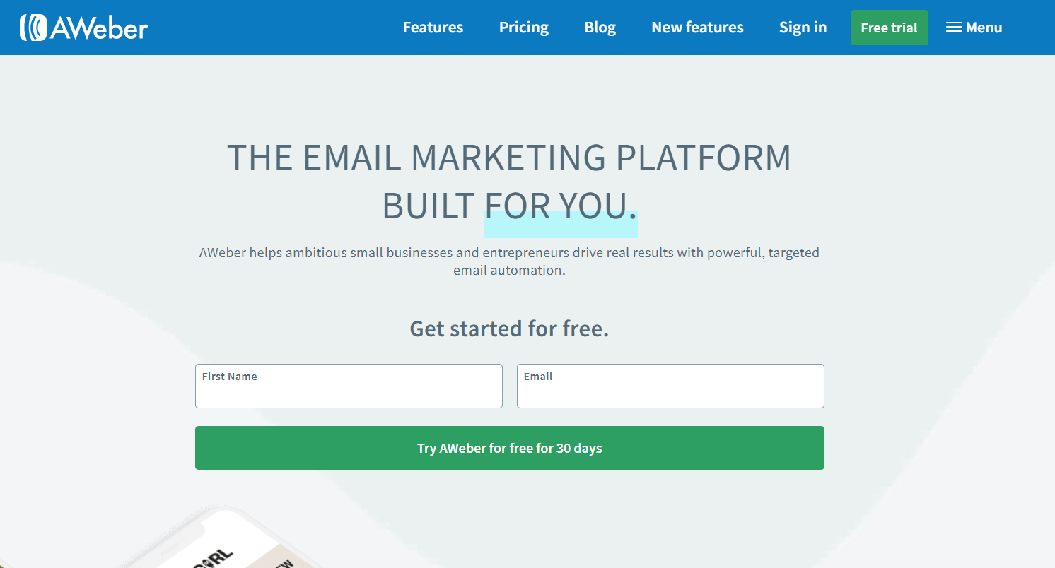
AWeber has an interesting take on conversions as they use a personalized headline, benefit-highlighting sub heading a concise form and a large CTA button. ‘Get Started for Free’ subline along with CTA button copy ‘Try AWeber for Free for 30 Days’ don’t let visitor miss out on what they will get on signing up for AWeber.
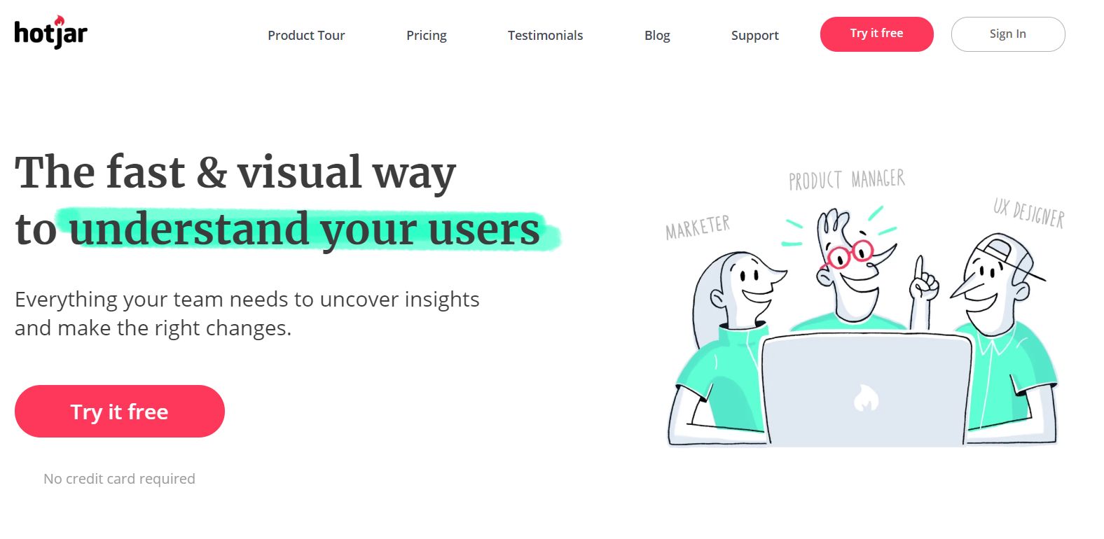
Hotjar is an analytics platform that offers heatmapping solutions for website owners to find out where visitors are spending most time on the website. The Hotjar homepage has an expressive banner that shows how the platform can provide value to the user.
The CTA button ‘Try it free’ along with a small subline ‘No credit card required’ shows how using Hotjar is completely risk-free and requires no monetary commitment.
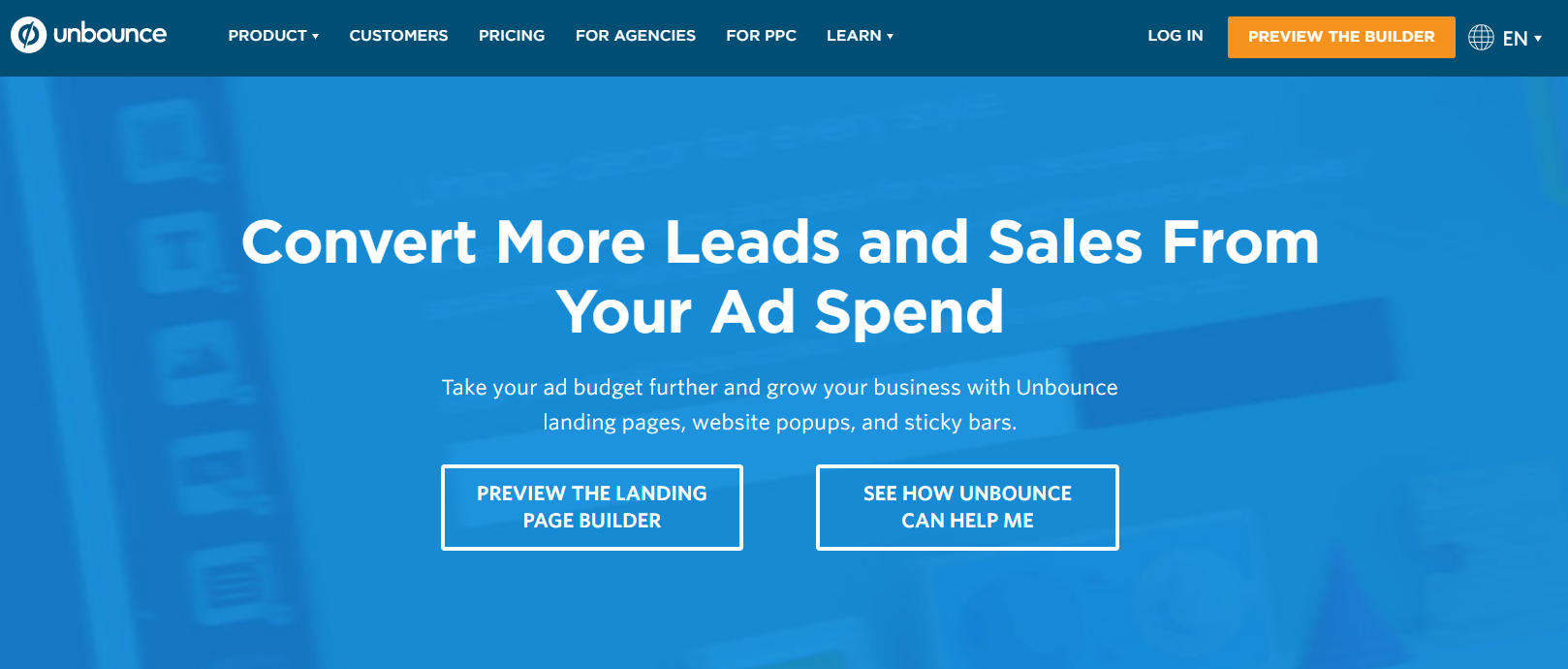
Unbounce is a popular landing page builder that portrays its expertise at its own website. Its multiple CTA buttons- from the contrasting ‘Preview the Builder’ on top gets the attention instantly.
Further, using two different CTA buttons on the main banner gives visitors further steps in their journey to discover how the platform can help them. Such CTAs are more about adding value and never makes a visitor feel that they are getting lured to buy something.
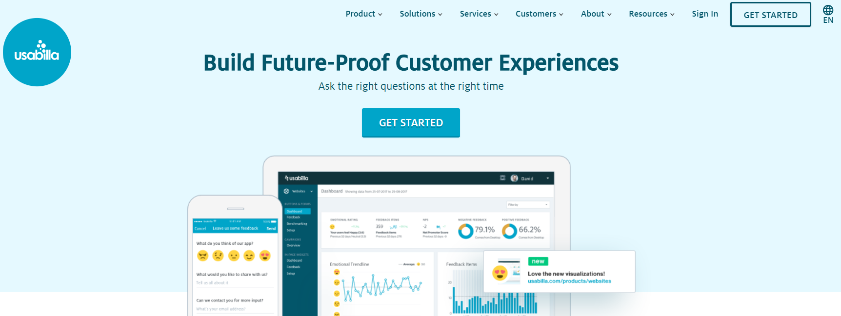
Usabilla is a user testing platform that allows businesses to test their product designs and experiment to master the art of offering a great user experience. The same gets reflected in its main CTA banner on the homepage.
The prominent CTA button with simplistic text ‘Get Started’ is enough when positioned along with a crisp copy that depicts the platform is all about building great customer experiences for the future in minimum possible words.
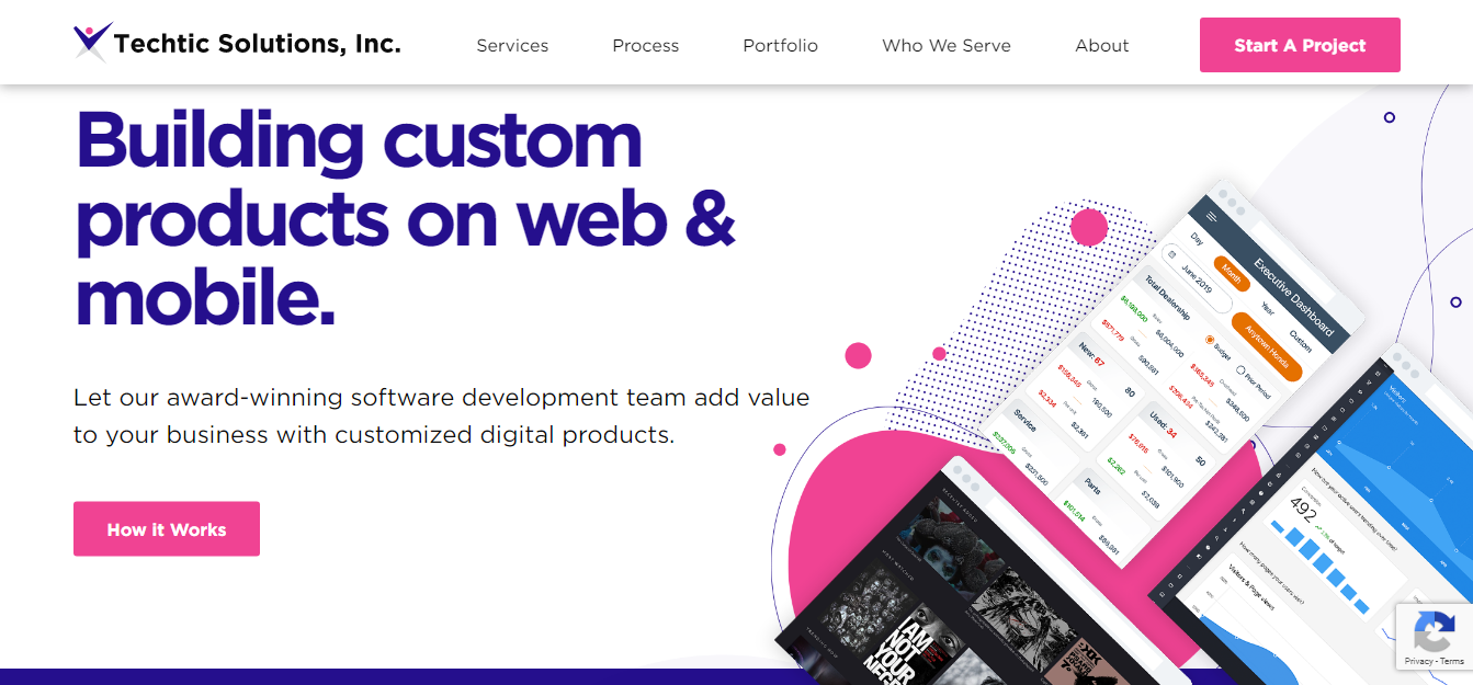
Techtic- an award-winning mobile app development company has used multiple remarkable CTAs on its website. The most impressive is the one that they are using on their service offering page. Instead of giving visitors and option to bounce back, they have efficiently tried to keep them hooked and appeal to their aspiration of getting in the league of successful businesses. The punchline highlights what customers will get on collaborating with them and a CTA button that stands out with ‘Start Your Project’ message is designed to persuade visitors to act.
So, that’s it! We trust that these examples will help you brainstorm effectively to find your next successful CTA for your website, landing page or digital marketing campaign. Let us know in comments which CTA do you like the most. Also, if you have any more which are eye-catching and clickable, we would love to know the same.
About the author:
Nisarg Mehta
 Nisarg Mehta is the CEO of Techtic Solutions, a leading iOS App Development Company. He has crafted, created and built Techtic Solutions Inc., which is an innovative technology and business driven firm with a clique of multi-talented and pulsating people in quest of opportunities to deliver the best. His passion for blogging & writing about innovative trending technologies has been constant for over a decade.
Email: nisarg@techtic.com
LinkedIn: https://www.linkedin.com/company/techtic-solutions
Twitter: https://twitter.com/techticsolution