To make your Instagram profile interesting and visible to your target audience (in other words, the people you want to sell something to), you need to stand out. How can I do that and get more followers for Instagram account?
With the help of visual design, a certain style. But how to make Instagram stylish if you are not a designer and do not know how to work in Photoshop? Let’s figure it out.
Does account style affect subscriptions and sales?
If you have a new account, beautiful photos and visual style may well become your USP.
When a new visitor comes to your Instagram, you need to get impressed and subscribe. And here a lot depends on how you work with the visual style of your account: what color palette, whether the photos are combined, whether you want to look at them, whether they convey the mood … A beautiful Instagram feed is your business card.
If you are selling some products, then the quality of the content affects the quality of the sales. Beautiful profiles on Instagram are remembered or stand out among similar profiles / competitors and give an idea of what kind of product we are talking about, causing the desire to buy the product.
If you sell services, the quality of the image is essentially equal to the cost of the subscriber. A beautiful visual style lowers the cost and makes it cheaper to acquire a new subscriber.
If you have an offline point, you definitely need to give the person a huge level of motivation to come from online to offline to you. And therefore, your picture must correspond: he must want to join this. It is important to understand here that people who are used to working on Instagram have a high level of observance. They immediately distinguish high-quality photos from low-quality ones.
Stages of work:
- Before starting work on the design of your page, evaluate your favorite profiles and competitor profiles on Instagram. Highlight the visual on Instagram and what you like and what, on the contrary, you don’t like about them (style, color, processing).
- But don’t forget: in order to develop a competent visual concept, you need to understand what you want to convey and to whom. This will determine what colors, photos and styles you will use to create your visual style.
- Beautiful Instagram takes time and planning. Make a content plan or rubricator. So you will know what to publish not for a day, but at least 2 weeks in advance, and a general view of the profile will be formed.
- Color scheme / palette – what colors suit you and like.
- What will be in the profile – photo / graphic content / templates (photo session, stock photos, minimal design). Don’t forget about the composition (symmetry, arrangement of objects in the photo).
- Filters / processing (muted colors or, conversely, saturated).
- Fonts (readable, medium size and not a circle with text from Snapseed).
- Design vision. But it’s not that hard if you find something that reflects your style and product well and stick to that line.
Color palette
We decide on the color palette (the color may depend on your brand book, logo, product / service, photo background color and even mood).
The options are:
- Go to Pinterest and search for “Color palette”
- Go to the website color.romanuke. Here you can choose a color palette in warm, cool, pastel or contrasting tones.
- If you have ready-made photos of the picture, go to the IMG online website. It will determine the basic colors of the picture. I recommend 3-5 colors for your account. If more – it will look bulky.
Please note that each color has its own name.
The palette has been selected, it can be changed:
- from season to season;
- 9 photos by blocks;
- from one color to another, using a transitional photo.
At the same time, it is important to preserve:
- photo style (minimalism, fashion-style photos, and so on);
- main genres of photography (portrait, landscape, macro photography, and so on);
- your own color accent (cool / warm colors, pastel shades, processing style and everything that makes your photos recognizable in the feed).
Where can I get photo / graphic content / templates?
- Do it yourself;
- order a photo session;
- use photos from photo stocks;
- make templates / stubs;
- order templates from a designer.
If you took someone else’s photo and posted it on your profile, the copyright holder may complain about you, and Instagram may ban you.
He bans no refund for stolen content.
You need to take photos only with an open license. For example, photos from photo stocks.
List of photo stocks with great photos and search by color:
- flickr
- styledstock
- libreshot
- lifeofpix
- freepik
- pixabay
- pxhere
- pixnio.com
- pexels
- photos.icons8
- unsplash
- Death to stock photo
- thestock
- stock.adobe
- depositphotos
- shutterstock
- kaboompics
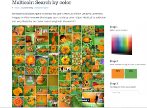
For example, we need orange pictures. Go to the Multicolr Search Lab website.
Step 1. Select the desired color / shade.
Step 2. If you also need green, choose the right. You can make your search easier by specifying tags.
Here’s what happened:
Options for positioning images in a profile
The stylish chess layout immediately grabs the user’s eye. You can achieve this effect by alternating pictures in a similar style through one. For example, add thematic quotes to photos. Or play with contrast, swapping classic photos for pastel or vibrant images.
Publishing posts in a line or diagonally will help to add personality. In such a placement, it is important to follow the order and prepare three photos at once for the account. These series are usually united by the color scheme, general style or visual presentation of the content.
Filters
You can see that large and experienced bloggers run their accounts at random. They already have an army of subscribers.
Younger bloggers use presets – custom filters with a set of settings that can be applied to photos in the free Lightroom CC mobile app.
Many bloggers have their own style / handwriting in submitting photos. That is, you can copy the specified parameters from the preset and apply them to process your photo. It can contain all the standard settings: white balance, exposure, brightness, shadows and others.
Thanks to the preset, you don’t have to waste time processing every time. You will simply use the ready-made settings and keep your account in one style. If you google, you can find many Instagram presets and instructions on how to use them.
Order of publications
Now let’s look at the options for the sequence of posts.
Instagram posts are displayed in cubes. Therefore, it is possible, as in the game of “tags”, to change the location and, accordingly, the type of profile.
Visual Themes for Instagram Profile Design
Monochromatic
The monochrome style is one of the least used, but it really makes your ribbon stand out from the others.
By the way, you can enhance some photos by using the contrast of light and shadow.
Minimalism
Clean and sharp photos are displayed in a minimalist style. This is very popular with designer business accounts.
Naturalness
One of the main trends of 2021 is to be real. Subscribers are captivated not only by your own thoughts, but also by the sincerity of the photos. Retouching and pretense is a thing of the past.
Golden hour
Another visual trend on Instagram is photos taken at the perfect time for aesthetic shots. The best images are obtained when the sun’s rays illuminate objects or people at dusk or dawn.
Color contrasts
Using a vibrant color scheme is ideal if you want your profile to look fun, upbeat and youthful. You can achieve a bold and vibrant effect. The choice of color is paramount. Warm colors such as red, yellow and orange are usually predominant.
Let’s summarize
Your Instagram profile can stand out in different ways and it doesn’t have to be boring. There are feeds that stand out for their content, regardless of the images. It all depends on you.
Maintaining the aesthetic of your profile grabs attention. That’s for sure, but remember that planning well-thought-out publications takes time and discipline.
You can try different styles, until you find one that suits you. Or you can change your style every 9 frames.
One more tip. Before changing your design theme, make the transition between one and the other. Just upload images that share the themes with each other.