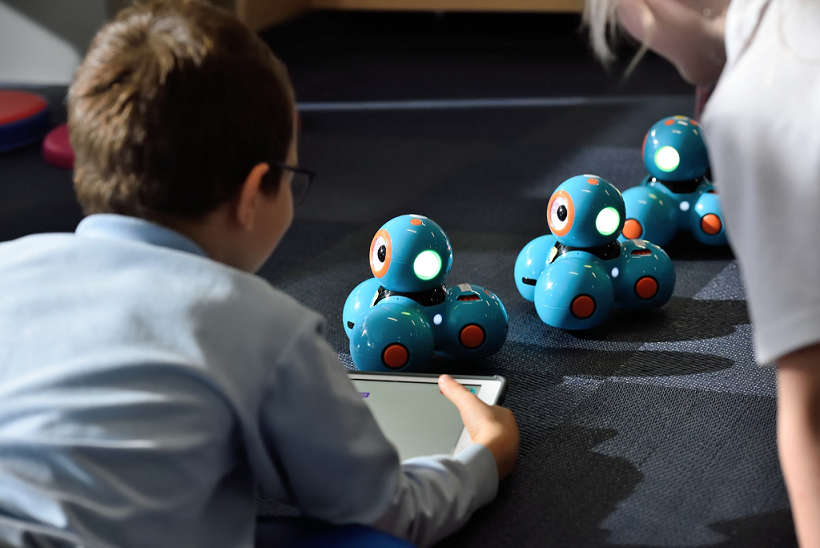
Creating kids’ eLearning software isn’t easy. Even the most experienced developers and designers might have trouble with figuring out what children like or want. eLearning apps for kids need to draw in and engage the target audience while also being very intuitive to navigate. If you’re planning to develop an eLearning software for kids, it is crucial to know what to avoid.
Before 2020, lots of eLearning tools were more of a fun addition to a traditional way of learning in the classroom. However, the COVID-19 pandemic forced the world to adjust its ways. It made eLearning a necessary part of education, causing a huge surge in the use and downloads of various edtech software.
SOURCE: Steelkiwi
With the help of eLearning platforms and apps, children and teens can acquire knowledge in a variety of areas. They train logical abilities by solving puzzles, learn history and biology facts, and can even practice real-life skills.
Platforms for practicing real-life skills are especially vital. With their help, kids and teens prepare themselves for “adult” situations and challenges.
To give an example, QniQr is a marketplace that teaches young people how to start their own stores and manage their finances. It was the first online marketplace for children and teens of this kind. Young people aren’t only introduced to handling money, but also to doing business and trading goods. It’s also a great way to help the environment through reusing toys, books and clothes, and buying fewer new things.
There’s a bunch of similar apps and platforms being developed every day, however, only the best ones are going to stand the test of time. So how do you steer clear from failure?
We created this short-and-sweet list of development mistakes you should avoid when creating software for kids and teens!
Mistake #1: Neglecting safety
Of course, safety is the number one priority that comes to mind when thinking of software for young people. Children are credulous, because they don’t fully understand the consequences of their actions beforehand, so they’re likely to trust adults. Teens are less naive, but also need protection, since they still might be manipulated. Therefore, it’s vital to build safeguards into software for children and teens.
Developers often consider the basics, like reporting abilities, but forget to think about the little nuances. On the example of Qniqr, let’s talk about what is important to control.
First, it’s necessary to determine who makes the decision to use the software or install the app — a guardian or a child? This decision makes a big difference. If the decision is made by parents/guardians, then there’s going to be more controlling functions for them. If the child decides, then it would be required that admins are more involved to keep the environment safe.
The platform has reporting capabilities everywhere, in chats, deals, posts, and users. It’s necessary to have these to make sure that a kid is going to complain immediately if a violation was committed.
Many platforms and apps have chats and/or comment sections where users are able to communicate. There’s a couple of ways to make them safer. You can involve third-party services that catch inappropriate or suspicious content, like swear words. Also, admins should be available to moderate conversations if such content was detected.
Platforms like QniQr also allow for image exchange, for cases where a buyer needs more pictures of a product. If your software has a similar capability, image moderation should also be thought through. There are lots of services that provide automated image moderation that guarantee 99.9% content safety. Artificial intelligence filters scan all of the images quickly and rigorously to ensure whether the content is appropriate. And if machines detect unwanted content, then the image should be reviewed by human moderators.
Mistake #2: Following stereotypes when designing UX/UI
Research, research, research. Don’t dive into the process thinking that kids of all ages are going to love lots of animation, sounds, or ultra-bright colors everywhere.
First, it’s essential to determine what age groups are going to use the software. A design for a 9-year-old is going to differ a lot from a design for 12-year-olds, because they’re in different cognitive, emotional, and physical states.
Youngsters above the age of 10 are considered to be teens, and won’t like the same design that kids below that age would enjoy. And if you plan to target people of many age groups, then you’ll need to make a universal design that is guaranteed to be liked by all of them. In any case, thorough research about the likes, dislikes, and wants of all the age groups is needed.
Some of the things that are going to differ depending on the age group of the target audience are interactivity, value, how intuitive the software needs to be, and the overall look and feel of it.
Yana Petlovana in her recent article gives general valuable tips on how to design a successful eLearning website and marketplace. This is going to be especially helpful if you’re in the process of planning an eLearning project.
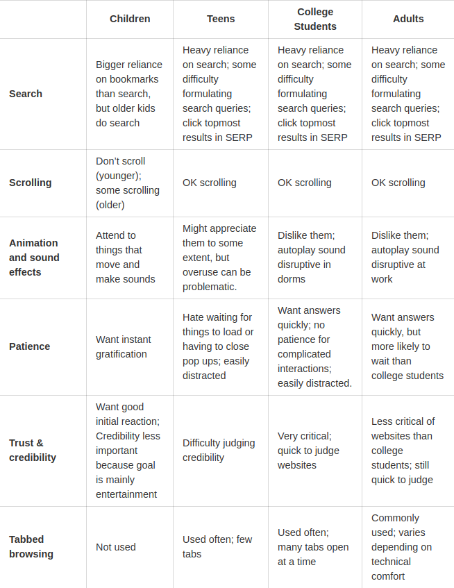
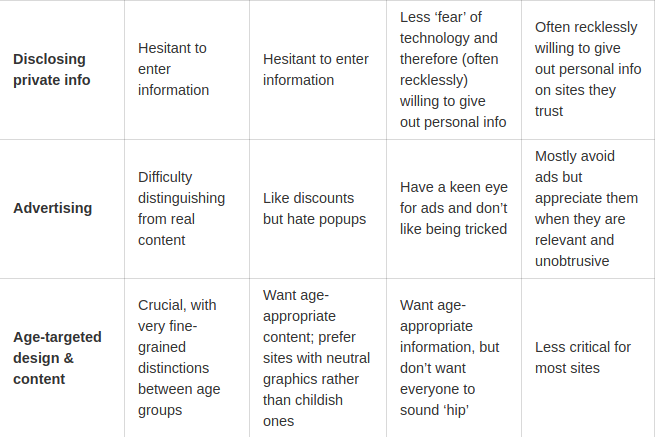
Nielsen Norman Group conducted research regarding the preferences of various age groups in UI/UX design and created this helpful table:
It’s also crucial to involve children and teens in the testing process of your eLearning software during the development to ensure that you’re on the right track, and also to catch any issues early.
For instance, you can notice that some kids get frustrated using certain features, like if interactive elements are at the bottom of the screen, or maybe it’s too easy for them to make a purchase, which will cause parents to delete the app or remove the account on the platform.
Mistake #3: Skipping the little details which can make the software better
There are hundreds, possibly thousands, of versions of any kind of app or platform. It’s essential to stand out and add little interesting or unique details that’ll make your product more memorable.
For instance, in a Snapchat app, every time you pull down to refresh the feed or messages tab, a little ghost flies up and changes colors or scatters a rainbow underneath it.
Qniqr platform implemented kids-friendly captchas, where instead of trying to find bicycles and boats on blurry photos, children get a couple of pictures with animals and have to pick a snail, or a turtle, and so on.
Not only kids, but teens and adults too enjoy these fun little details and interactions that leave a better and more lasting first impression.
#4 Last but not least, other dealbreakers include. . .
- Slow loading screens
- Bad image resolution
- Error-prone functionalities
These issues can cause users to abandon your platform right away, because a bad quality slow-loading site causes lots of frustration, especially with children.
Hopefully, this information will give you some pointers in the education app development process!
In addition, if you’re interested in building an eLearning platform/app, it is recommended to schedule a consultation with a custom software development company that has experience in creating successful eLearning products. They’ll offer specific advice based on your situation and share the details about the creation process.